

A real estate project earns a clearer place in buyers’ minds when its story and visual identity work together. Strong estate visual identity and graphic branding align four elements: project positioning, brand messaging, a usable visual system, and consistent use across touchpoints. Together, they help people understand what makes the project distinct and create a coherent impression at every interaction.
Buyers notice more than a logo. The words, imagery, colours, and details they encounter should reflect the project’s character and audience. This guide explores four ways to shape that experience, from defining a clear message to creating visual concepts that work across print, digital, and physical spaces. A consistent identity can support recognition, build trust, and give potential buyers a clearer reason to take the next step.
Key Takeaways
- Keep project branding consistent across digital and physical touchpoints so each interaction builds recognition.
- Shape logos, typography, and colour into a flexible visual system that stays clear across applications.
- Use a distinct, authentic tone of voice to communicate the project’s purpose and connect with its intended audience.
- Set the project strategy before developing visual concepts, then create a cohesive system that can grow with the development.
1. How does a strong visual brand identity help generate leads in 2026?
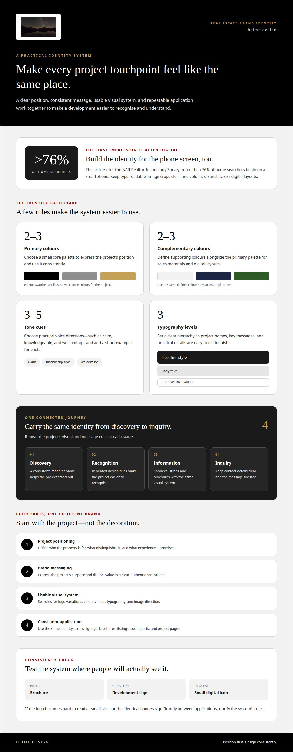
A consistent identity helps a property project become recognisable before a buyer makes an inquiry. Each encounter should reinforce the same impression, from a street sign to a listing on a phone. That familiarity gives potential buyers a clearer sense of what the development offers and who it is designed for. More than 76% of home searchers begin their search on a smartphone, according to the NAR Realtor Technology Survey. Digital presentation is therefore a key part of the first impression.
Start with a simple set of visual rules and apply them across channels. Use the same logo, colour palette, type styles, and image treatment in a printed brochure, site signage, and online property listing. A development sign might introduce the project name and palette, while a matching brochure carries those elements into a sales meeting. When each format feels connected, people can recognise the project without relying on its name alone.
Digital consistency needs the same care. Keep the identity aligned across property listings, social posts, digital brochures, and project pages. Use type that is readable on phone screens, clear image crops, and colours that remain distinct against different backgrounds. Someone moving from a social post to a listing should see one coherent project, not separate versions of its brand. That continuity makes the offer easier to understand and the next action, such as enquiring about a viewing, easier to find.
Plan the journey as a sequence: discovery, recognition, information, and inquiry. At discovery, a consistent image or name helps the project stand out. At the information stage, repeated design cues make brochures and listings easier to connect. At inquiry, clear contact details and a focused message show the next step. For estate visual identity and graphic branding, consistency is practical, not decorative. It reduces friction between channels and presents the project’s value clearly. Track which touchpoints lead to inquiries, then refine the message or layout where readers lose momentum.
2. How a Strong Brand Identity Elevates Real Estate Projects?
Effective branding for residential estates in Poland starts with a clear position: who the property is for, what distinguishes it, and what experience it promises. The logo, typography, and colour palette should express that position rather than follow decorative trends. Choose two to three primary colours and two to three complementary colours, then define how each will appear across sales materials and digital layouts.
Typography also shapes a project’s personality. A refined serif can suggest heritage, while a clean sans serif can feel contemporary. Choose a style that suits the audience and architecture. Set a hierarchy with a headline style, body text, and supporting labels. Define font sizes and weights so the project name stands apart from details such as floor plans, amenities, and contact information. On social media, the same hierarchy helps viewers identify the main message at a glance.
Common mistakes include choosing visuals before defining the project’s position, using too many colours, and selecting a logo that becomes hard to read at small sizes. Test the logo on a brochure, a sign, and a small digital icon. If the identity changes significantly between applications, clarify the system’s rules.
A useful branding brief specifies the target audience, project positioning, key differentiators, desired tone, and intended applications. It should also list deliverables, such as logo variations, colour values, typography rules, image direction, and usage guidance. Naming formats like signage, brochures, and social media posts helps the design system address real project needs from the start.
These decisions turn visual choices into a working system, not isolated assets. A focused real estate graphic design approach can help translate the project’s position into a cohesive identity across its materials.
A real estate brand identity brings positioning, values, and tone together with a design system. Its narrative should communicate the project’s vision, purpose, and key differentiators, while a defined photography style helps keep the identity consistent across marketing channels.
3. Brand messaging and tone of voice
A real estate brand needs a clear message before it needs more copy. Define the project’s audience, purpose, and distinct value, then express them in one central idea. For example, a residential estate might focus on considered urban living, while a heritage property could foreground its architectural character. The message should explain what the project offers and why it matters to the people it serves.
Next, set three to five tone cues to guide every writer. Choose practical descriptions, such as calm, knowledgeable, and welcoming, rather than vague directions like “sound premium.” Add a short example for each cue. A knowledgeable voice might explain a building feature in plain language; a welcoming voice might invite readers to explore the available layouts. These examples make the guidance useful across brochures, social posts, and sales conversations.
Give the project a story rooted in place and purpose. A location’s history can provide context, while the development’s future vision can show how residents might experience it. For instance, messaging for an estate near a historic town centre can acknowledge its setting, then describe the project’s intended character without making unsupported claims. Similarly, destination-focused real estate sites like krissyinthekeys.com show how grounding property marketing in a specific coastal lifestyle helps prospective buyers connect with the setting. This keeps the story relevant to the property and grounded in what the project can genuinely communicate.
Use the same message structure across channels: introduce the project, explain its defining value, then offer a clear next step. A brochure can provide more context; a social media caption can lead with one concise benefit. Both should use the same terms for amenities and features. Create a simple vocabulary guide with preferred descriptions and words to avoid, then review new copy against it before publication.
Authenticity and transparency in real estate branding can support stronger engagement and loyalty. Describe features precisely, distinguish completed details from future plans, and avoid language that promises an experience the project cannot demonstrate. When the story, tone cues and facts align, the brand feels distinct without relying on exaggerated claims.
4. Brand identity and visual concepts
Creating a real estate brand identity starts with strategy, not a logo. Define the project’s audience, position, values, and differentiators before choosing type, colours, or imagery. During planning and pre-development, translate those foundations into visual concepts while the project can still shape its public identity. For a residential scheme, the architecture, location, and intended experience can guide the creative direction.
Develop a visual system that works beyond a presentation board. Pair a headline font with a readable body font, then test both in a brochure, on a sign, and across a digital layout. Plan iconography for potential uses such as wayfinding, signage, and digital kiosks. These applications reveal whether the visual language supports real project needs or works only in a single mock-up.
Set a clear image direction for photography, video and CGI. For example, a coastal development might use a consistent light, composition and material palette across interior and exterior visuals. Keep layouts modular so new phases, property types or campaign materials can use the same design logic without looking identical. The system should extend to digital brochures, social channels and 3D or augmented reality tours where relevant.
Then test the concept across its complete journey. Review a small logo as a digital icon, a detailed layout on a phone screen, and a headline in print. Check that colour relationships remain clear and key information is easy to scan. If a concept depends on one format, refine its rules before rollout. The practical takeaway is to build an adaptable system around the project’s values, rather than a collection of disconnected visuals.
Bring your project’s strategy into a cohesive visual direction with graphic design support for real estate branding.
Heime.design: Graphic Design
heime.design offers graphic design for real estate projects that need a clear, cohesive identity. Turn to this service when the project’s positioning is defined but its visual direction still needs to take shape across marketing materials.
The work can translate project values and audience needs into practical design choices, including logo design and graphic elements for project communications. For developments connected to an interior design or renovation project, those visuals can complement the wider design direction, bringing the property’s character and presentation into closer alignment.
Share the project’s purpose, audience, and intended applications to guide the work. Contact heime.design to discuss graphic design for your real estate project.
Give your project a clear next step
A real estate brand can develop as the project moves from concept to place. Let its identity respond to real project decisions, audience needs, and the experience the property is intended to create. A considered approach to estate visual identity and graphic branding can connect these elements without forcing every message into the same format.
For projects where visual communication sits alongside the design of the property itself, heime.design offers graphic design, luxury interior design, and luxury interior design and project management for international clients. Bespoke interior design, renovation, and project management can also support projects shaped by both design and renovation needs.
Bring your project’s direction and priorities into the conversation. Contact heime.design about your brand and take the next step with a clearer sense of what you want the project to express.
Frequently Asked Questions
How a Strong Brand Identity Elevates Real Estate Projects?
A strong identity gives a development a recognisable point of view, helping prospective buyers understand its character before visiting. For example, a family-focused estate can communicate space and everyday practicality, while a heritage conversion can foreground its connection to the building’s past. This clarity helps people judge whether the project suits their priorities and gives sales teams a coherent framework for presenting its features.
How does a strong visual brand identity help generate leads in 2026?
A strong visual identity can support lead generation by making a project easier to recognise and its next step easier to find. In 2026, map the path from a social post or property listing to an inquiry form, then keep project cues recognisable along that route. Review which messages prompt inquiries and adjust confusing layouts or unclear calls to action. This improves the experience without treating design as a substitute for relevant information.
What elements are included in a real estate estate branding system?
A real estate branding system includes visual assets and rules for applying them. Alongside core design elements, specify photography and CGI direction, graphic layouts, icon use, and examples for brochures, signage, and social posts. Include approved file formats and guidance for adapting assets to different sizes. For instance, a campaign template can help teams create a property announcement while keeping it connected to the wider project identity.


