

Brightness belongs in the design, not as an afterthought. Often, yes: you can adjust it when the artwork’s light source or fixture is dimmable. For art display, 3000K-4000K is a typical color-temperature range, with the right choice shaped by the artwork and interior palette. Thoughtful art collection display and lighting in interior design also depends on placement, viewing distance, and how each piece relates to the room.
It’s easy to focus on the lamp and overlook the wider composition. Light should reveal a work’s colour and texture without competing with it, while sculptures and personal objects need enough space to feel intentional. Start by considering the collection, room lighting, and furnishings as one composition. This guide explains where to position illuminated art, how to arrange framed works and three-dimensional pieces, and how colour rendering and temperature affect what you see. It also offers practical ways to balance a collection with the room’s palette, architecture, and everyday use, so the display feels considered rather than crowded.
Key Takeaways
- Combine framed works and three-dimensional objects with attention to scale, spacing, and visual balance.
- Use sculptural pieces and personal objects to shape a focal point or give an overlooked corner purpose.
- Let wall colours, architectural details, and room layout support the collection rather than compete with it.
- Choose light for accurate colour and a comfortable atmosphere, then direct it to suit each artwork.
1. Where should illuminated art be placed?
Arrange wall art as a single visual composition, balancing each piece’s scale, spacing, and position. For a gallery wall, group related works by colour, medium, subject, or collection, then align their edges or centres to create a clear rhythm. Leave enough space for each work to stand on its own. Smaller pieces can form one larger composition rather than appearing scattered. A considered art collection display and lighting interior design plan clarifies these relationships before you choose fixtures.
Place lighting to serve the artwork, not simply the wall. Picture lights work best when their width suits the frame; a useful guide is 65-75% of the artwork’s frame width. For textured surfaces such as impasto, angle the light to reveal depth without flattening brushwork. Glass can reflect nearby light, so adjust the beam and fixture position to reduce glare from the main viewing area.
Combine flat artwork with three-dimensional objects to add depth. Hang a painting above a console and place a small sculpture or personal object below it, leaving enough clear surface to keep the arrangement composed. A pedestal can bring a smaller sculpture closer to eye level. On shelves or furniture, lean one framed work against the wall and layer a smaller piece in front. Vary heights and overlap pieces carefully without hiding important details.
Use the architecture as part of the display. A fireplace, alcove, or broad sofa wall can frame a collection, while an offset piece can balance a large area without forcing symmetry. For valuable works, acid-free matting and UV-protective glass are archival options. Keep artwork away from prolonged direct sunlight, which can fade and degrade it. Effective art collection display and lighting interior design considers the wall, objects, and light together, with each element supporting the others.
2. Displaying sculptural art and personal objects
Give each sculptural piece a clear role: a focal point, conversation starter, or finishing touch to a small vignette. On a console, pair one substantial object with a picture or a few collected items, leaving visible surface around each. This negative space helps the eye distinguish shape and material. A vintage bowl beside a contemporary sculpture can create contrast, while repeated finishes or colours help the objects feel connected.
Layer pieces by varying height, depth, and texture. For example, place a framed work at the back of a shelf, add a smaller vintage object in front, then set a low sculpture beside them. Keep the picture visible, and avoid placing delicate objects where everyday use could knock them over. In an awkward corner, one statement sculpture can complete the composition. Several unrelated objects may make the area feel crowded.
Light sculpture from more than one direction when one beam leaves harsh shadows or hides detail. Adjustable track lighting can direct a beam at an individual object and reduce unwanted shadows. Recessed lights positioned at a 30-degree angle to the artwork’s centre can help reveal form. In a living space, an ambient-to-accent lighting differential of 3:1 to 5:1 can separate the highlighted piece from the surrounding room without letting it dominate.
Use a pedestal to raise a smaller sculpture and give it visual presence, especially beside lower furniture or a seated viewing area. Choose a top surface that supports the object’s footprint, then leave room around it for a clear outline. To prevent glare and uneven illumination, angle lights away from reflective surfaces, use diffused beams and low-glare fixtures, and balance accent light with ambient light. A coordinated lighting plan can bring those choices together when a collection includes varied materials and forms.
3. Architectural features, colour palettes, and room organisation
Use architectural details to give a painting a clear setting. A fireplace, recessed niche, or dark wall can frame a focal point without extra decoration. Designer Alvin Wayne placed a client’s artwork above a fireplace against a dark grey wall, helping it stand out. Neutral walls offer another approach: they let vivid colours and fine details lead, while a classic room can connect framed art with existing mouldings and furniture.
In a small room or apartment, keep the display focused. Choose one main painting for a wall or alcove, then use an adjustable track light to direct illumination without adding a large floor lamp. A compact sculpture can sit on a console beneath the artwork, with clear space around both pieces. This arrangement gives the eye a focal point while keeping circulation areas open.
Room organisation shapes how people encounter a collection. In a living room, place the strongest work where it can be seen from the main seating area. In a hallway, a sequence of smaller works can guide viewers along the wall. In a den, arrange seating for lingering and direct it toward the artwork. These choices make art part of the room’s mood and movement.
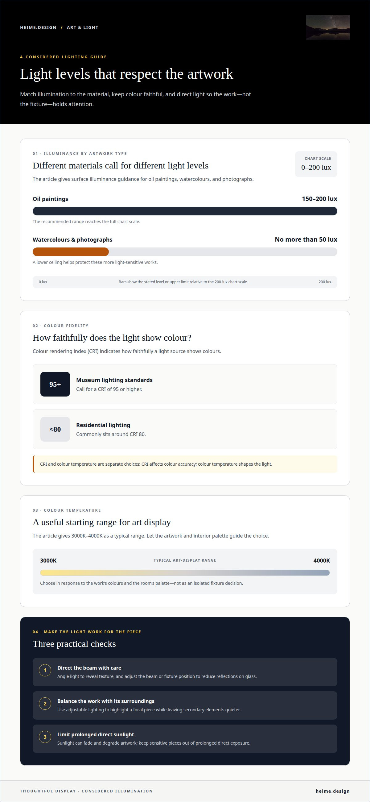
Set illumination by material, not room alone. Oil paintings can receive 150-200 lux at the surface, while watercolours and photographs should receive no more than 50 lux. In a living area, adjustable lighting can highlight a focal painting while leaving secondary elements quieter. For a home office, a sculpture beside the desk can add visual interest without competing with the work surface. Keep sensitive pieces out of prolonged direct sunlight to reduce fading and degradation.
4. Color rendering index and color temperature
Colour rendering index, or CRI, indicates how faithfully a light source shows colours. Museum lighting standards call for a CRI of 95 or higher, while residential lighting commonly sits around CRI 80. For a contemporary painting with subtle textures, higher colour fidelity can help preserve distinctions between nearby tones. Treat CRI and colour temperature as separate choices: one affects colour accuracy, the other shapes the light’s warm or cool appearance.
A typical art-display range is 3000K-4000K, selected to suit the artwork and the interior palette. In a warm living room, 2700K-3000K can create a softer effect for bedroom artwork. Colour photography may benefit from 5000K-5500K lighting. Test the chosen temperature against the painting and wall together; a minimal white room and a deep accent wall can make the same work appear different.
LED lighting suits sensitive artwork because art lighting should use low-heat sources, a stable colour temperature, and minimal ultraviolet exposure. Some non-LED sources can emit heat or UV that may damage valuable works. Track lighting describes an adjustable fixture system, not a light source: it lets you direct each beam at a painting, sculpture, or hallway display. Halogen is a non-LED option, so assess its heat and UV exposure rather than assuming every lamp performs alike.
For Polish homes, these display recommendations are practical guidance, not a statement of Polish or EU legal requirements. Electrical safety and fixture installation must follow applicable local requirements. To make art colours read consistently, coordinate CRI, colour temperature, wall finish, and accent lighting across the room. A considered lighting design for artwork can bring those choices together with the wider interior.
Heime.design: Lighting Design
heime.design offers Lighting Design that brings artwork, room layout, and illumination into one considered plan. It’s a natural next step when a collection includes paintings, photographs, and sculptures with different lighting needs, or when existing fixtures don’t support the display.
The design process can coordinate accent and ambient light with wall colours, viewing positions, and architectural features. For a broader project, Lighting Design can be part of Luxury Interior Design & Project Management for international Clients or Bespoke Interior Design, Renovation & Project Management. The aim is a coherent interior where the collection feels integrated, rather than added after the room is complete.
Contact heime.design to discuss Lighting Design for your collection and interior.
Plan a display that can grow with your collection
Before making changes, decide what you want the room to offer the collection over time: a calm place for close viewing, a changing display, or a more expressive focal point. That choice can guide which pieces deserve prominence and how the space should adapt as the collection grows. A considered approach to art collection display and lighting in interior design starts with these priorities, so future additions feel intentional rather than squeezed into leftover wall space.
HEIMÉ Interior Design can translate those priorities into a cohesive home project, connecting lighting, interiors, and renovation coordination. This is useful when a collection is part of a wider residential redesign or new works need to sit comfortably alongside existing furnishings. Start with the pieces you value most and how you want to live with them.
Contact heime.design to plan your display. Give your collection room to feel at home.
Frequently Asked Questions
Can the brightness be adjusted?
Yes, if the artwork’s light source or fixture supports dimming. Adjustable track lighting also lets you redirect a beam when the display changes, although repositioning is different from dimming. Check the effect at different times of day: fixed-brightness illuminated artwork may suit the room for only about two hours daily. A dimmable setup can offer more control as ambient light shifts.
Where should illuminated art be placed?
Place the artwork where people can view it comfortably without blocking circulation or competing with another focal point. In a living room, consider the main seating position; in a hallway, keep the display clear of the route through the space. Avoid prolonged direct sunlight, and position the light to limit reflections from glazing. A mock-up at the intended height can help you assess sightlines before installation.
What color temperature and color rendering index are suitable for gallery lighting?
A typical art-display choice is 3000K-4000K, paired with a color rendering index of 95 or higher for faithful color appearance. The best temperature depends on the artwork and surrounding palette. For example, a warm-toned painting may sit naturally under warmer light, while a collection with varied hues can benefit from a more neutral appearance. Keep lighting consistent across works viewed together.
How can UV and heat damage to artwork be minimized?
Limit prolonged direct sunlight and choose low-heat lighting with minimal ultraviolet exposure. Non-LED sources can emit heat or UV, so avoid placing them close to sensitive works. Keep the room’s temperature stable, since fluctuations can warp or degrade delicate pieces. For organic materials, humidity regulation also matters. Inspect the artwork and its surroundings regularly for changes such as fading, distortion, or surface deterioration.
What are common mistakes and risks when displaying valuable artwork at home?
Common risks include prolonged sun exposure, excessive illumination, glare on glazing, and unstable temperature or humidity. Watercolours and photographs need especially controlled light levels, while organic materials can be sensitive to humidity changes. Another mistake is treating every work alike: a thickly textured painting and a reflective photograph respond differently to beam direction. Inspect pieces regularly so early changes don’t go unnoticed.


