

The most personal family-estate identity may be the one that reveals the least. A monogram, wordmark, or heraldic-inspired device can carry meaning without turning private history into a public statement. Bespoke monogram and logo design for family estates begins with that balance: what the mark should express, and what it should leave unsaid.
Choosing a direction can feel uncertain. A fashionable look may lose its connection to family history, while a traditional symbol may feel too formal or reveal more than the family intends. The answer is not to include every story. It is to identify the values and references that matter, then give them a clear visual direction.
This guide will help you compare identity approaches, set priorities and boundaries for a designer, and consider how a mark can work across appropriate estate materials and settings. You will also see how graphic design can complement the wider character of a family property. The aim is an identity that feels considered, discreet, and connected to the estate’s enduring character.
Key Takeaways
- Shape an estate identity that reflects family character and stewardship while keeping private details private.
- Use typography, proportion, negative space, and symbolism to build a visual language with lasting relevance.
- Compare monograms, wordmarks, and heraldic references by legibility, privacy, and intended use, not perceived prestige.
- Brief bespoke monogram and logo design for family estates with clear goals, boundaries, applications, and carefully chosen references.
- Consider how graphic and logo design can complement the wider character of a family estate.
Why bespoke monogram and logo design matters for a family estate
A family estate has a character shaped by its people, its setting, and the way it is cared for over time. A considered visual identity can express that character on selected materials without turning family history into a public account. It is not simply a personal signature, a business brand, or decoration added to a property. It gives the estate a consistent visual presence while leaving room for privacy.
A bespoke estate identity is a tailored visual expression of a family’s character, its property, and its approach to stewardship. The mark might use initials, the family name, or a symbolic form. Its purpose is to connect those elements to the estate, not to suggest status through ornament or imply a story the family does not wish to tell. This is the core of bespoke monogram and logo design for family estates: meaning shaped to fit the people and place.
What makes an estate monogram or logo bespoke?
Bespoke design starts with direction, not a template. The family’s values, the property’s character, and the intended level of formality help determine whether the identity should feel restrained, expressive, traditional, or contemporary. Custom lettering can give a family name a distinct voice. A symbol can refer to a feature of the estate or a value the family chooses to share.
The decisions are often subtle. Letter spacing may make a monogram feel open rather than formal. A simplified symbol may remain clear at a small size, while a more detailed treatment could suit a larger application viewed up close. These choices make the identity responsive to its context. Familiar motifs such as crowns, shields, or ornamental flourishes are not automatically appropriate. A reference on the history and meaning of monograms can help clarify what an initial-led mark communicates, but the estate’s own brief should guide its final form.
Unlike a personal signature, an estate mark represents a shared place or family stewardship, not one person’s handwriting. Unlike a business brand, it need not be built around selling or promoting a service. And unlike a decorative motif, it should have a clear reason for its visual choices.
How heritage and privacy shape the design brief
Family history can inform an identity without appearing in full. A family does not need to display a genealogy, reproduce private details, or make every historical reference visible. Decide what belongs on public-facing materials and what should remain within the family. For example, a shared value or visible architectural detail might be suitable inspiration, while personal names, dates, or sensitive family stories may not be.
Separate documented facts from personal interpretation. A verified feature of the estate can be treated differently from a story remembered within the family. This distinction helps the design remain meaningful without presenting interpretation as fact. It also gives the designer practical boundaries: which references are welcome, which are private, and how formal the identity should feel.
That care connects visual identity to the broader stewardship of a property. In UHNW residential design and legacy estates, the estate’s character is considered as part of a wider, long-term environment. A visual mark can be one considered layer of that character.
How estate identity design turns family meaning into a visual language
A strong identity begins with choices, not decoration. A family might value discretion, continuity, or a close relationship with the land. The estate may be known for balanced architecture, a particular landscape, or a quieter atmosphere. These ideas can guide the visual language without appearing as literal pictures. The design task is to find a clear form that feels connected to the estate and works in its intended settings.
Typography sets the voice. A serif typeface may suggest formality, while a more restrained letterform can feel contemporary without chasing a trend. Proportion affects character too: tightly arranged initials can create a compact mark, while generous spacing gives the same letters more openness. Negative space is an active part of the design. It can clarify a shape, separate initials, or keep a symbol from feeling crowded.
Restraint can make an identity more adaptable. A mark with fewer details is often easier to recognise at different sizes and across different materials. Still, simplicity alone is not the goal. The elements should feel distinctive and remain legible, whether viewed on a formal document or a small printed item.
Choosing symbols, lettering, and references with intention
Each visual element should have a reason to be there. A symbol might draw on an architectural detail, landscape feature, or shared value, if the family agrees it belongs in the identity. Heraldry can offer a point of reference, but it is not a default requirement. Before concepts are developed, set boundaries around initials, dates, motifs, and personal details. This gives the designer room to interpret meaning without adding imagery simply because it looks traditional.
Consider the identity as a small visual system rather than a single finished mark. Typography, spacing, scale, and any chosen symbol should support one another. A consistent approach can help the estate’s stationery and documents feel related, even when their layouts or purposes differ.
Practical review matters. Look at the proposed mark at the size and in the context where it may be used. Do the letters remain distinct? Does a symbol still read clearly when reduced? Is there enough space around the mark to keep it composed beside written information? These checks reveal when detail needs simplifying or proportions need adjusting. They also help distinguish an expressive concept from one that functions well in everyday use.
For bespoke monogram and logo design for family estates, the direction should connect family meaning to the estate’s character while remaining usable across the applications the family selects. heime.design provides graphic and logo design alongside its work in legacy estates and family-office interiors. Its design work brings these considerations together.
Monogram, wordmark, or heraldic reference: which estate identity fits?
The right form depends on what the family wants the identity to communicate and where it will appear. A monogram puts initials first. A wordmark makes the estate name the main feature. A heraldic reference draws on a visual tradition, but it should be chosen for its relevance and style, not as a claim of ancestry or status. Compare the options by how they read, how much they reveal, and how well they suit intended uses.
| Approach | Character | Legibility | Privacy | Suitable contexts |
|---|---|---|---|---|
| Monogram | Initial-led; can feel restrained or expressive through its lettering | Clear when initials are distinct and the design is not overly detailed | Offers discretion, though initials may still identify a family | Selected stationery or documents where a compact mark is useful |
| Wordmark | Name-led; places emphasis on the estate’s name | Direct and readable, especially when the name is distinctive | Makes the name visible, so consider the intended audience | Materials where immediate name recognition matters |
| Heraldic reference | Formal or symbolic, depending on the treatment | Varies with the detail and scale of the design | Can communicate chosen references, but may carry associations the family should consider | Contexts where a heraldic visual language suits the family’s direction |
When a monogram is the clearest choice
Choose an initial-led route if the letters hold meaning for the family and remain easy to distinguish at the sizes where the mark will appear. Letterform, spacing, and proportion can make initials feel formal, contemporary, or understated without relying on fixed style labels. Test the mark at a reduced size. Fine lines, interwoven letters, and decorative details can blur together when scaled down. A monogram is not automatically a marker of prestige; it is one practical design choice.
When a wordmark or symbolic mark may work better
A wordmark may suit an estate with a distinctive name when clarity matters more than a coded symbol. A separate symbolic mark can work when the family prefers a concise visual cue, or when repeating the full name would feel too prominent. Consider both against intended visibility: who will see the mark, how quickly should they recognise it, and on which materials will it appear?
Heraldic references call for particular care. A family may be drawn to heraldry’s structure or visual language without using a historical coat of arms or implying a lineage. Treat it as a deliberate stylistic direction. Agree which elements are appropriate, then assess whether the resulting design is clear and proportionate for its uses.
There is no single format that suits every estate. The strongest direction balances recognition, privacy, and practical use. Compare concepts in context rather than judging them only as isolated artwork. A mark that feels compelling at large scale should still read clearly in more modest applications.
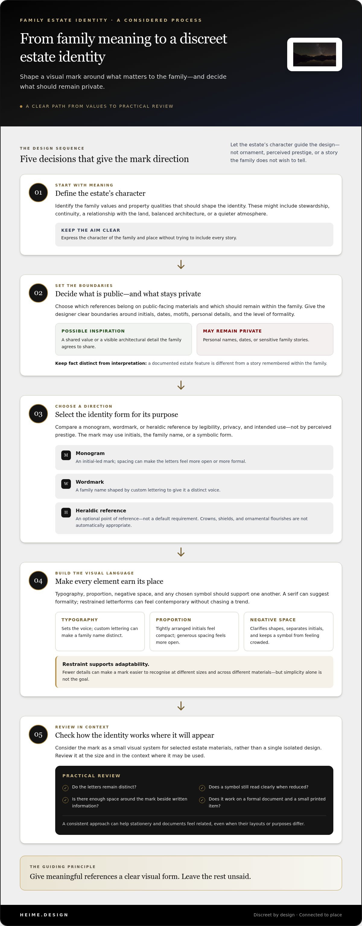
How to brief and evaluate a bespoke family-estate identity
A useful brief turns broad ideas such as “timeless” or “understated” into clear design priorities. For bespoke monogram and logo design for family estates, explain who the identity represents, what it needs to communicate, and where the mark may appear. A clear sequence helps the family and designer make decisions without trying to capture every detail of its history.
- Define the purpose. Describe the impression the identity should create and what it represents: the family, the estate, or their shared stewardship.
- Set boundaries. Identify private details, sensitive references, and motifs or visual approaches the family wants to avoid.
- Select applications. Name likely uses, such as stationery or estate documents, so concepts can be reviewed in practical context.
- Review concepts. Compare each direction with the agreed priorities, rather than judging by personal taste or current trends alone.
What to include in the creative brief
Start with a short description of the estate’s character and the impression its identity should leave. Add relevant references, such as architectural details, landscape features, or family values, and explain why each matters. Separate documented facts from personal interpretation. A remembered story may be meaningful inspiration, but it should not be presented as documented history unless the family has established that distinction.
Make the brief specific about visual preferences and limits. Note whether initials, dates, names, symbols, or heraldic references are welcome, and list anything that should stay out of the design. Include privacy considerations and clarify who will contribute to decisions. Agreeing on a small group of decision-makers and shared priorities can keep feedback focused.
How to review design directions with confidence
Assess each concept against the brief. Ask whether it represents the intended subject, feels appropriate to the estate, and has a distinctive character without relying on decorative detail alone. Check legibility at relevant sizes. Initials should remain recognisable, and a symbol should retain its shape when reduced. Consider balance too: letterforms, spacing, and any graphic element should feel composed together.
Review concepts in the applications identified in the brief. A direction that looks clear on a large page may feel crowded on a smaller document. Gather feedback using the same criteria for each option: relevance, clarity, privacy, and suitability for intended uses. Ask contributors to explain comments against those points. This makes it easier to resolve conflicting preferences and reduces revisions based only on individual style associations.
A considered brief gives the designer useful direction while leaving room for interpretation. heime.design’s design approach brings graphic and logo design together with the wider context of the estate.
Working with heime.design on bespoke identity for a family estate
An estate identity works best when it feels connected to the property and the family it represents. heime.design provides graphic and logo design alongside legacy-estate, UHNW residential, and family-office design. This combination places a visual mark within the estate’s wider character, rather than treating it as decoration with no relationship to its surroundings.
That connection does not mean the identity should imitate the architecture. A historic façade, a calm landscape, or a contemporary interior may inform the design, but the mark still needs its own clear purpose. Consider how formal the estate’s identity should feel, how visible it should be, and whether it should emphasise the family name, initials, or a more discreet visual cue. The direction should reflect the family, the estate, and the intended uses.
A design perspective grounded in the estate as a whole
Visual restraint can support privacy and continuity. A carefully chosen detail may acknowledge a property’s character without competing with its architecture or making the identity feel overstated. The right level of expression depends on the family’s preferences. Some may want a name to be immediately clear; others may favour a quieter mark for limited, considered use. Bespoke monogram and logo design for family estates should reflect those choices, not impose a fixed idea of what an estate identity ought to look like.
heime.design’s work in legacy estates and family-office interiors provides a relevant context for considering identity as one part of a larger environment. Graphic design decisions can respond to the same priorities that shape a family’s relationship with its property: character, discretion, and stewardship. The design direction is tailored to the project, rather than tied to a standard package or promised outcome.
What to prepare before an initial conversation
A little preparation can make the discussion more focused. Bring the estate name, a short account of what it means to the family, and examples of where the identity may be used, such as stationery or estate documents. These applications are starting points for defining the brief, not assumptions about what the design must include.
Useful references might include architectural details, materials, landscape features, or existing visual elements. Explain what feels appropriate and why. It is equally helpful to identify what does not fit, whether that means a particular motif, a level of formality, or a detail the family prefers to keep private. Separate documented information from personal interpretation so each can be considered appropriately.
Finally, clarify who will contribute to decisions and who will provide the family’s direction. Shared priorities can keep feedback coherent as design ideas are considered. Note privacy boundaries before discussing references, names, or family history. The goal is to give the work a clear framework while leaving room for considered creative judgment.
For an identity shaped around your estate and family, heime.design’s family-estate design work brings graphic design into the context of the property and its character.
Give the estate’s identity a considered next step
The first useful move is not choosing a symbol. It is deciding what the identity should represent, where it belongs, and what the family wants to keep private. Those priorities give the creative work a clear starting point and help prevent a visual direction from being driven by passing preferences.
Bespoke monogram and logo design for family estates can be approached as one part of the estate’s wider character. heime.design brings graphic and logo design together with its work in legacy estates and family-office design, connecting the mark to the context it represents. The identity should feel personal to the family, appropriate to the property, and purposeful in its intended uses.
When you are ready to shape that direction, discuss a bespoke family-estate identity with heime.design. Start with the meaning you want to carry forward, and let the identity take shape from there.
Frequently Asked Questions
What is a bespoke monogram for a family estate?
A bespoke monogram is a custom-designed arrangement of initials shaped for a family and its estate. For example, a designer might explore how two initials sit together, then test whether each letter remains identifiable in a small printed application. The family’s preferences and intended uses guide those choices. In bespoke monogram and logo design for family estates, a monogram is one possible format, not a requirement or an automatic sign of prestige.
Should a family estate use a monogram or a logo?
Choose based on what should be recognised first. A monogram can suit an identity where initials are familiar to its intended audience. A name-led logo may be clearer on a document that needs to identify the estate immediately. Compare options in actual contexts, such as a formal letter or an internal record, and consider who will see them. Neither format is inherently more appropriate; the family’s priorities should decide.
Can a family estate logo include a coat of arms?
Yes, a family-estate logo can draw on heraldic references if the family considers them meaningful and suitable. First decide whether the reference reflects documented history or simply appeals as a visual style. That distinction matters: ornamental elements should not be presented as proof of ancestry, rank, or legal status. A clear brief can guide the designer toward an original treatment, from a subtle visual influence to a more explicit heraldic direction.
How do you make an estate monogram feel timeless?
Build the design around qualities the family expects to endure, rather than details chosen only because they are fashionable now. Clear lettering and balanced proportions provide a useful starting point. Ask someone unfamiliar with the design to identify the initials, then view the mark at the smallest intended size. If the letters merge or ornamental details disappear, simplify the drawing. No design can guarantee timelessness, but practical testing helps avoid preventable issues.
What information should I give a designer for a family-estate logo?
Provide the estate’s name, the purpose of the identity, and where you expect to use it. A short note about the property’s significance can offer context without sharing a full family history. Add references with comments on what appeals to you, and identify visual directions to avoid. Also name the decision-makers and mark any confidential information clearly. This gives the designer useful context while helping protect details the family wants kept private.
Who owns the rights to a bespoke family-estate logo?
Ownership and permitted use depend on the written agreement and the laws that apply to the project. Before work begins, clarify who may use the final design, for which purposes, and whether the agreement covers an assignment of rights or a licence to use it. Do not assume that paying for design automatically transfers every right. For a specific agreement, seek advice from a legal professional familiar with the relevant jurisdiction.
Can a family-estate identity be updated later?
Yes. A family can revisit its identity if the estate’s needs or intended uses change. Before revising it, record which elements still matter and which no longer serve their purpose. For example, a mark created for formal correspondence may need reconsideration if it will also appear on smaller printed materials. Keeping the original rationale helps guide changes, preserve meaningful features, and avoid revisions driven only by a short-lived trend.


